Clinical Trials
As Endpoint Clinical's first ever in-house designer, I led a full platform redesign across navigation, UI, and workflows — interviewing 14 users, running an advisory group of 7+ clients, and building Endpoint's design foundation from scratch.
.png)
Overview
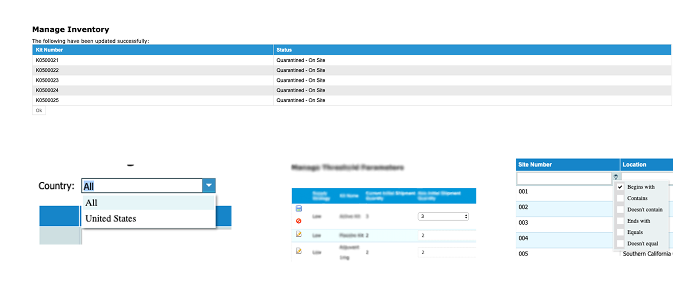
Clinical trials are the fundamental research tool for pharmaceutical companies to determine if a drug is safe, effective, and reliable. Pulse is a customizable template that helps manage, store, and run clinical trials effectively. Every trial needs to be processed through our “pre-production phase” in order for a personalized system to be created.

Problem:
The endpoint platform has design inconsistencies across applications that were difficult to utilize and workflows that are time consuming for users to complete
Vision:
"One unified product platform with a simple navigation, consistent product styling, and seamless flows across all endpoint applications."
Challenges:
- Endpoint's product is a highly customizable system that requires all design components to work cohesively
- Our external users are not easily reachable and had limited opportunities for user feedback and user testing
- The development code had specific limitations which caused extreme design restrictions
Research
The first step of the design process involved understanding the product and then knowing the workflow and our users. In order to gain the most insight of our product, we relied on industry experts and our senior leadership who have dedicated their whole career in this field to guide this process.
Interviewing Users
We conducted 14 individual interviews consisting of industry experts, endpoint clients, and endpoint employees. Participants were asked to describe the most common tasks they perform on a regular basis, then were asked to talk through their experience and share any pain points or feedback they might have.
- Sponsor: Users that typically oversee and manage the life of a clinical trial. Tasks include trial configuration, inventory management, client support, and reporting
- Site: These are users that are considered "on the ground" and typically blinded to trial data. Their tasks include screening patients and handling the distribution of drug kits
- Endpoint: Internal users who help the pre-production setup of each individual trial and provides customer support throughout the life of each trial
.svg)

Advisory Group
Consisted of 7+ endpoint current clients and industry experts. The meeting covered the following product related topics: (1) UI/UX of our product (2) Feedback on current functionality (3) Future Growth
Focusing on the User Experience
Before the official launch of this project, the user experience was not a focus point for our products. As Endpoint was preparing to release a new application update in the upcoming year, they realized there was an opportunity to strengthen their products by bringing in UI/UX design. There was an overwhelmingly positive response from our users to the news of an update to endpoint's products.
Goals:
- Improve the user's first time experience by simplifying navigation throughout the systems Users have a difficult time navigating within the product and across the various applications
- Create UI consistency through one product branding style Users find the UI elements difficult to work with and feels outdated compared to other applications
- Reduce frustration by guiding the user through one coherent flow Users are often frustrated with the repetitiveness of flows when trying to complete an action
(1/3) Simplifying Navigation
Sponsor and site level users have access to multiple trial and inventory management systems at once. However, the user is required to have a separate accounts for every system and is forced to log in and out of each one with the appropriate username and password. This gives the impression that every part of our system is independent from one another and that each system has its' own set of rules.
You have to memorize all the functions. Which things to pick in the menu...You have to come to the software knowing what you need to do." - Endpoint User
Pain points
- Users have to remember separate login information for each system
- Steep learning curve to understand how the features work
- The support application runs separately for each system
- Inventory systems are independently accessed instead of linked to a trial
.svg)
The "Simple" Navigation
- Single sign on reduced the number of credentials a user has to remember and allows one single login information to access all trials and inventory system
- One overarching support application that covers all systems which give the user only one destination for support related actions
- Following the 'F-Shaped' scanning pattern, the global navigation runs horizontally that remains consistent throughout the entire application and the sub-vertical navigation changes according to the selected system

(2/3) UI Updates
One of the most consistent feedback we received from our current users, both internal and external, was the need for a user interface (UI) refresh of the whole platform. This was unanimously agreed upon across all levels of the company throughout the years.
"You would never know the intelligence that's in our software from the way it looks like." - Endpoint Employee
User Pain Points
- Users find themselves zooming the screen because of the small text
- Tables and grids have disproportionate sizing to the screen
- Icon styling looks outdated and locations are in odd placement
- Inconsistent UI components across pages
The "New" User Interface
The focal point was to have consistent UI elements throughout the entire platform. The color scheme, typography, and standard UI elements were carried over between systems and used appropriately on all pages. The consistency in our platform would help create predictability for users when switching from system to system.

- The use of color was important to convey the product brand identity and the help create clear visual guidance in our UI components
- Visual hierarchy in typography were applied to the page layouts to help users scan pages quickly

Setting Expectations - Design components that clearly communicates the action and functionality
Simple Interface - Using familiar design components and layout structure
Consistency - Using the same design components across pages to increase predictability
(3/3) Single to Multi Step Form
One of the most common formats used in the product follows a questionnaire styled flow. Currently, when a user enters a workflow, the user would answer one question on the page and click next to a newly loaded page with a second question and will continue the same format until the workflow is completed.
"Screening forms for patients could have a long list of questions, so you can imagine how many times users would have to click next" - Endpoint Employee
User Pain Points
- Users have to make multiple unnecessary clicks to complete one flow which is repetitive and time consuming
- User cannot easily undo their action and would have to redo their entire task for one minor mistake
- Users are not provided with any clear feedback of their actions

Minimize Actions - Streamline related tasks to prevent user from moving to multiple screens
User Control - Provide the user the ability to easily undo their action or exit the task flow
Patterns & Learnability - Utilizing the same design with similar navigational flows within the product
Responding to the User - Providing visual cues to inform the user of the current status with a progress bar
Early Design Process
The iteration process involved the feedback of our users, development, and stakeholders. The primary focus was to provide the user an efficient way of completing the task but to also have the flexibility to cater to all other edge cases.
- Users enjoyed having a progress bar incorporated in the design
- Users preferred having all the questions in one view instead of sections
- There could be scenarios where an additional step is needed after a form is submitted

The Multi-Step Form
Site users will typically start workflows with the intention to complete the form and will repeat the same task workflows throughout the life of the trial. The multi step form design provides the product the flexibility it needs to accommodate forms capturing extensive data points.
- Progress meter provides the visual cues to the user of the current status in the workflow
- Users can easily undo any inputs from any point in the flow without having to transition screens
- Provides the user with full control to complete or exit the action
- The page view limits three input sections at a time to prevent user from feeling overwhelmed
- The fixed footer can provide visual connection between the form and the possibility of an additional step following the "Submit" action.

User Testing & Results
Throughout this process, we had many of our users involved in the decision making process to help guide the direction of the designs. As we began to create changes, the sales team was provided the prototype to gain immediate feedback from prospective clients. Additionally, each workflow was presented in a controlled testing environment after every sprint in front of stakeholders ranging from 15-25 individuals. At the end of the design and development process, the product team created anonymous surveys for the advisory group (10) and internal employees(4) to collect feedback regarding all the new changes.
.svg)
Reflections
This was an incredible opportunity for me to lead endpoint's first large scale UI/UX endeavor. Even though clinical trials is a complicated and highly regulated industry, I learned that the design process was consistent and is universally applicable with any product. This role allowed me to be part of a real time development process from start to finish. It was very gratifying to contribute to the world of clinical trials in a time of a pandemic and being able to impact the health of people around the world.