Healthcare Chatbot
I designed LumaBot — Luma Health's first patient-facing chatbot from concept to launch in 3 months, shipping a product that immediately generated multiple upsell opportunities and became a high-priority expansion for the company.
Overview
Luma Health wanted to do more to improve the patient inbound experience. How can we meet patients where they are without adding extra work onto everyone’s plates? Our solution is "LumaBot", an extension of the front desk and a virtual assistant who is available 24/7, 365 days a year.
Problem:
Clinics are limited in resources to handle patient inbounds and patients are not willing to wait for their health related needs.
Company Vision:
"Needing healthcare is hard, but getting care shouldn’t be."
Research
Who are the users? What are they trying to achieve? What can we do to match those goals? These are the questions we try to answer through this investigative phase.
Top reasons patients call the office
- Scheduling: Patients need to book an appointment or make changes
- Directions: Patients need directions to the health facility
- Medical Emergency: Patients need to call the facility when their health is at risk
- Nurse advice: Patients need guidance on steps to take for their current circumstances
- Prescription refills: Patients need to call the facility to adjust their prescription
- Insurance Questions: Patients need to ask questions about their insurance coverage
Problems with phone calls

- Frequent mistakes occur with triaging the patient to the correct representative
- Long waiting times results in dropped calls and a poor patient experience
- The number of call representatives to patient ratio is the primary bottleneck
The Users

Why chatbots?
- Ability to self triage according to the consumers' needs
- Reduced patient frustration with quicker turnaround times
- Immediate service provided without increasing headcount
- Improved efficiency by minimizing redundant tasks
Top chatbots
There are tons of chatbots out there catering to different user needs. We look at the top healthcare centered chatbots to understand their core strength as a product.
.svg)
Chatbots are nothing new...but what can we do differently?
- Creating an experience where clients and patients feel connected
- Integrate directly with the client's current processes and electronic health record (EHR) system
- Allowing customizability to the user interface (UI) and workflows to match each clients' needs
Core components
It is important that the basic design elements and user flows are intuitive for the average user. The exploration phase was a critical step to ensure we were accomplishing that goal before jumping into the intricacies of the design.
Goal: To create a modern, easy-to-use experience that is familiar to the average user.
.png)
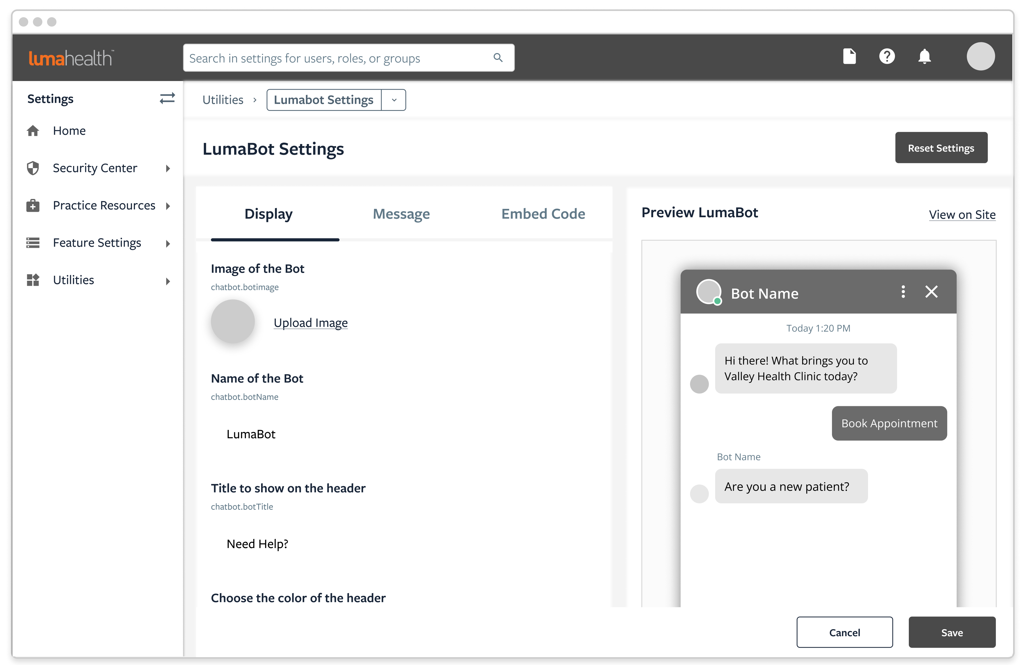
Determining the basic UI elements
- Chat widget as the starting point
- Standard bot sizing including frame, header, and footer
- Message bubbles & appropriate padding to account for various message lengths
- Font text style & size to consider all age groups
- Familiar patterns including icons and animations
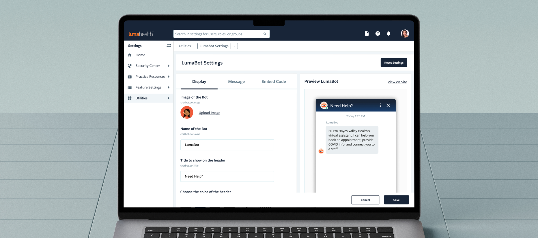
Settings configuration
- Designed according to the company's current UX patterns and UI elements
- Tabular design to limit the number of settings presented in one view
- Providing customizable UI elements to match the client's branding
Introducing...LumaBot
After forming the basic UI elements for the chatbot, we focused on what features and experiences we wanted to create by aligning with the company’s goals.
- Getting patients care faster - Creating pathways for patients to complete an action within a few clicks without distraction
- Safety & Privacy - Healthcare is a very private and sensitive issue for many people. When our users are relaying their personal information through the chatbot, we want our users to feel that the information is being processed in an accurate and secure manner.
.png)
Interact with the prototype or check out live in action!
(1/6) Speak With Staff
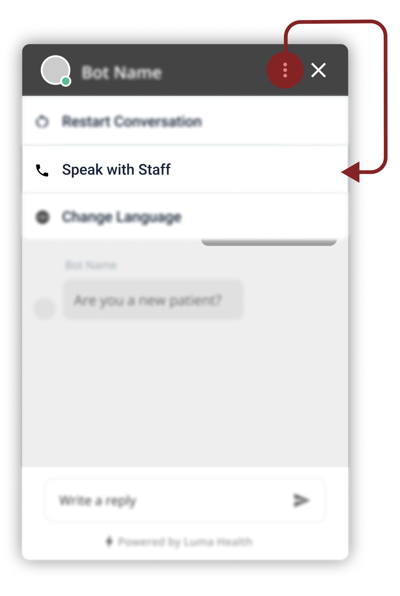
Some patients may have difficulty interacting with a chatbot or can have unexpected requests. This function allows patients to connect with the facility for any reason.
Why we chose this design
- Intentionally grouped under the ellipsis to prevent it from being the primary action
- High visibility area where the user can still have an opportunity to see the action
Other designs considered
- Embed the option in a conversation workflow: Would not be readily available at any point in the conversation
- Icon or Text button: Would not be completely intuitive for all users & takes too much space
(2/6) Call Back Request
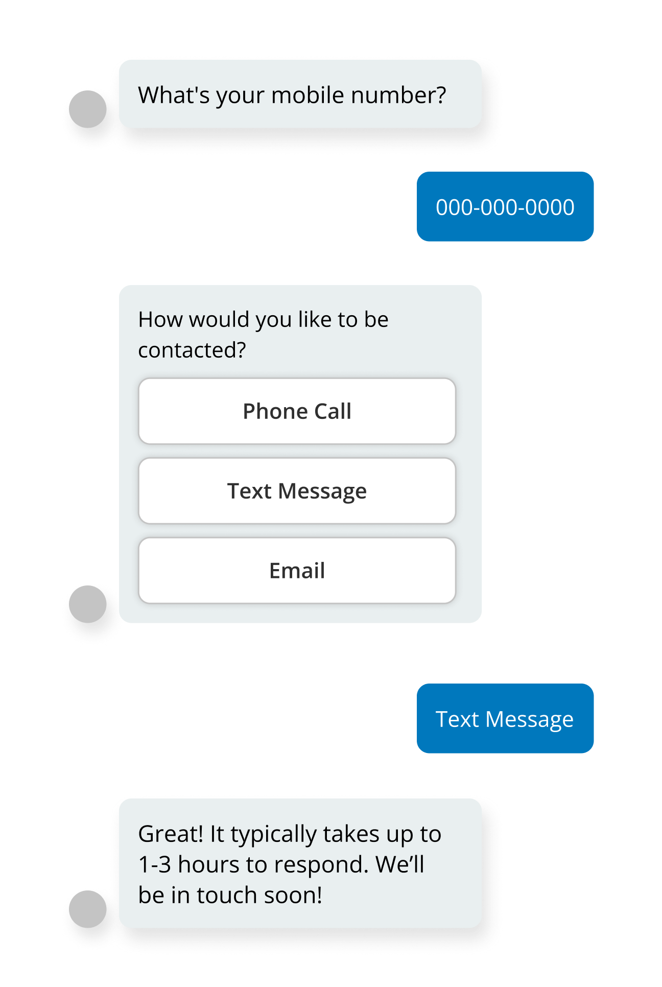
Frequently, patients may need to speak with a healthcare representative directly by phone for complex situations. This function allows patients to move on with their day, knowing that someone will address their concerns.
Why we chose this design
- Patient authentication is required before any official health communication
- Easily embedded in workflows to prevent conversation roadblocks
Other designs considered
- Embed option into the top navigation: Would bypass patient authentication and risk violating patient privacy
- No feature: Unable to close the loop on workflows when necessary
.png)
(3/6) Booking Appointment
Booking appointments is a critical part of the healthcare experience and one of the most frequent reasons why patients call the facility. The in-chat & EHR integrated booking experience allows users to quickly match their schedules to their providers, ultimately reducing redundant calls.
Why we chose this design
- Presented the first available appointment slots to utilize the open spots efficiently
- Simple and quick experience, to encourage patients to book appointments at their convenience
Other designs considered
- Calendar view: Would require a larger screen estate, which is unrealistic for the frame size
- Expanding chatbot size for an appointment booker: Could be overwhelming for certain user groups
(4/6) Restart Conversation
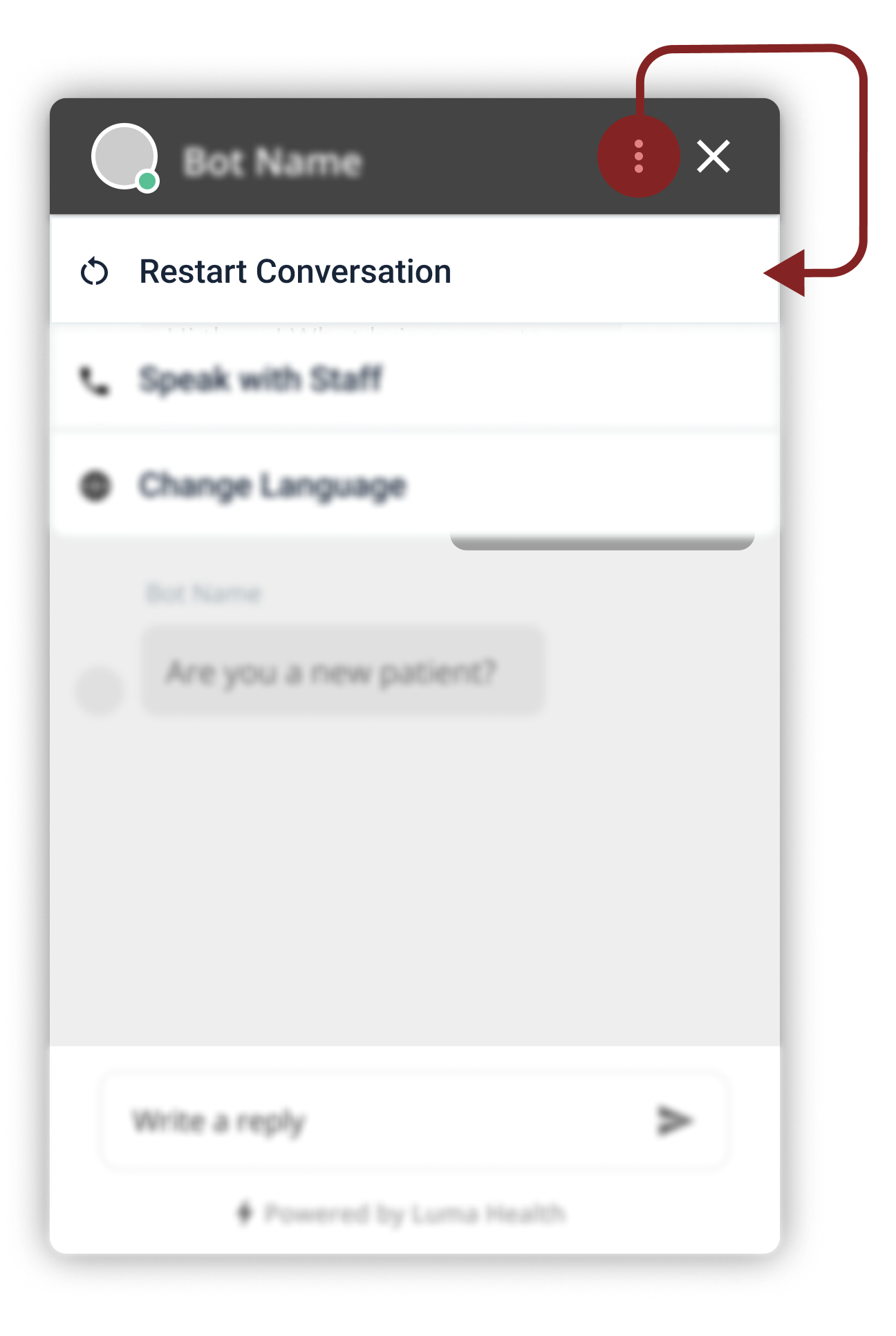
Often times people make mistakes and input the wrong information in the conversation. This could result in bad care or poor communication with the facility. A restart function minimizes that risk.
Why we chose this design
- Intuitive location
- Quick access
Other designs considered
- Typing restart: not intuitive, unless a tool-tip is provided (which may clutter the main frame)
- Placing the restart function in specific conversation workflows: inconsistent experience and may miss edge cases where the restart may be necessary
(5/6) Undo Last Response
.png)
The patient should feel like they could make mistakes without permanent repercussions. Users should be able to undo their most recent message conveniently, or else, they will frequently resort to the restart function for every mistake.
Why we chose this design
- Visible button next to every message to give the users confidence that they can always go back
- Dynamic experience and users don’t feel funneled into one workflow
Other designs considered
- Button at the bottom right of the chatbot (action bar): increase risk of misclicking the send or undo action
- Typing undo in the conversation: not intuitive, and the new “undo” message inserted will be immediately erased, which is a confusing experience
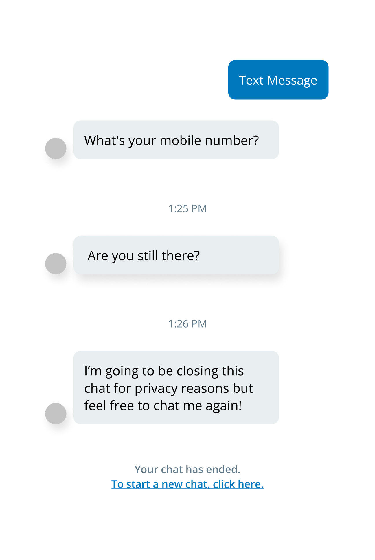
(6/6) Session Timeout
Health information is sensitive personal data that requires continuous efforts to protect it. A session time out ensures a secure experience occurs even when the user is absent.
Why we chose this design
- Automatic trigger after several minutes of idle status for security
- Defaulted function for all of our clients
Other designs considered
- Hiding personal data with asterisks: the user may want to see their previous inputs
- External links for inputting sensitive information: counterproductive for an efficient and simple experience
Branding
After the basic design elements are decided, it is time to incorporate the right colors and themes to match the product to the existing brand.

Color Theme
Selecting the default state colors is no easy feat when considering the client's different brand styles. Our goal was to select a neutral palette that could be versatile with other color palettes.
.png)
- Header: Navy gradient - base color comes from Luma's primary color palette
- Message Colors: Bot message bubbles were selected from Luma's secondary color palette (to also blend in Luma's brand). The user bubble was inspired by the common blue theme (to maximize familiarity).
- "Powered by Luma" Footer: The chatbot will be utilized on the client's homepage where most users will not know the powering system comes from Luma. Therefore, the footer provides the opportunity to increases brand recognition and exposure.
Avatar (temporary)
The goal of the default avatar was to keep it generic and luma branded. Many variations were explored and ultimately, the most neutral design was selected for the beta version of "LumaBot".
.svg)
User Testing

Findings:
- All tasks had over 85% success rate
- Mouse click heat maps demonstrated good correlation with the UI elements
- Minimal negative feedback (e.g wished they could see a comprehensive list of doctors; which is more functionally related)
"Really easy to use compared to a lot of chatbots I've seen" (External User)
Results & Reflections
LumaBot was successfully launched on March 7th, 2022.

Key Highlights:
- Prototypes initially created for a health conference was also cross-utilized by both marketing & sales teams
- Within the first weeks of launch, there were multiple upsell opportunities with current and new clients
- Due to its early success, future plans to expand the chatbot’s functionality was immediately placed as a high priority
"When we saw LumaBot, we immediately knew it was what we needed to provide a more modern, omni-channel experience to our patients." (Anchorage Neighborhood Health Center)
Project Challenges:
- Strict timelines with a go-to-market date established early in the process
- Limited resources and lack of internal processes
- Difficult design and engineering constraints throughout the project
How could I have improved?
- Additional research on non-healthcare related chatbots could have been done to support the design
- More time spent on the exploration and feedback phases
- Implementing user testing on real client websites and their established workflows
I'm thankful for:
- Opportunity to bring a concept to life and have a real impact in healthcare and others
- Great teamwork with the PM and engineers despite the stressful timelines and work hours
- To work on a project where I can consider myself as a real world user