Report Builder
I redesigned an overlooked enterprise reporting tool that users couldn't find and didn't know how to use — delivering a solution in 3 months where 100% of surveyed employees responded positively and the feature became a selling point for the sales team.
Overview
When users are unable to use the report building tool themselves, they would have to request customized reports from the business directly. This consumes internal resources to complete the users' request.
Problem
Drive's current report builder feature has been overlooked by users due to the difficulty of use and lack of visual appeal
Approach
Our approach was to understand the scope and provide a design within a set timeline. The product team and development leads worked collaboratively on a daily cadence to ensure all goals were being met for each deadline.

Challenges
- Product is a highly customizable system that requires all design components to work cohesively
- External users are not easily reachable and limited opportunities for user feedback and testing
- Development code had specific limitations which caused extreme design restrictions
Research
Our team interviewed four sponsor users to understand the main issues with the report builder tool. Each interviewee was asked a set of questions relating to their typical workday and their interactions with the tool.
The User
Sponsor typically oversee and manage the life of a clinical trial
- Ensure the study is configured appropriately and supplied across all related site locations
- Ensure drug supplies are efficiently sourced to facilities
- Rely on Endpoint's "Drive" application to analyze the supply data

Key Findings
- Users could not confidently locate the feature
- One out of four users did not know the feature existed
- All four users expressed their confusion in visual elements
- All four users felt they were unsure if they were taking the correct steps
- All four users spent the most time determining how to set filters on the report
Findings to Goals
- Discoverability: Help users find the tool & encounter the feature
- Visual Design: Minimize visual distractions & enhance UI components
- Learnability: Reduce frustration by providing digestible information
(1/3) Discoverability
Pain point #1: Users are unable to locate the feature confidently
Goals:
- Locate the feature within a few clicks
- Create opportunities for users to encounter the feature
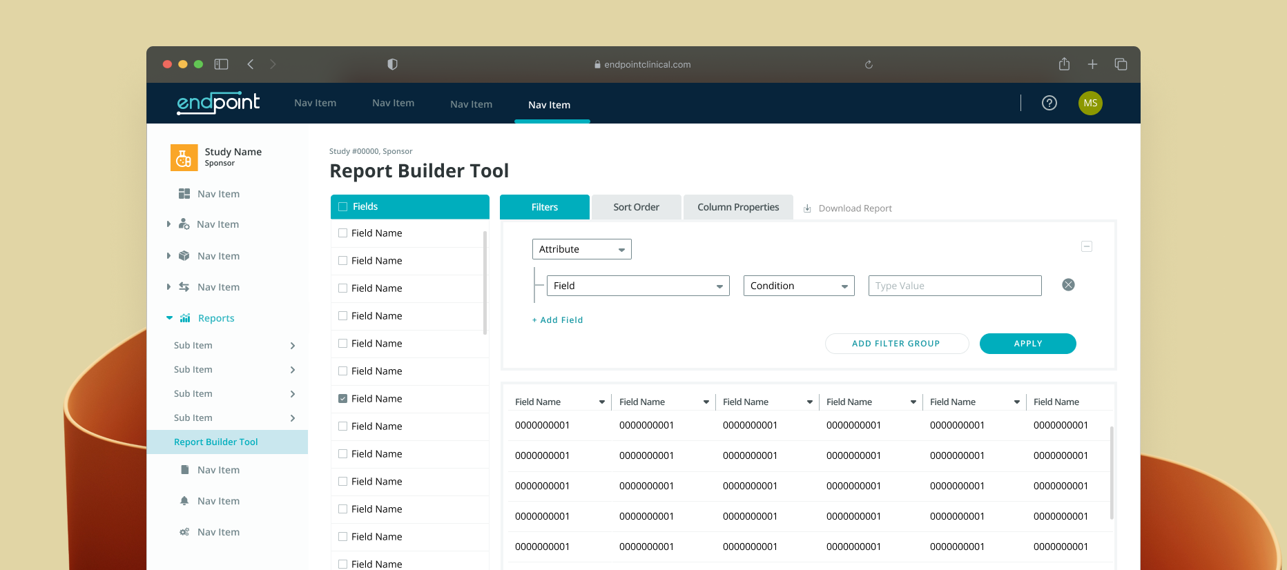
The current experience had all navigational items located on the top of the webpage. Although this design typically can accommodate large number of menu options, it became a visual and usability issue due to the overwhelming options with sub navigation items. This design was also not scalable with the business and their future plans to create a mobile friendly experience.

Top to Left
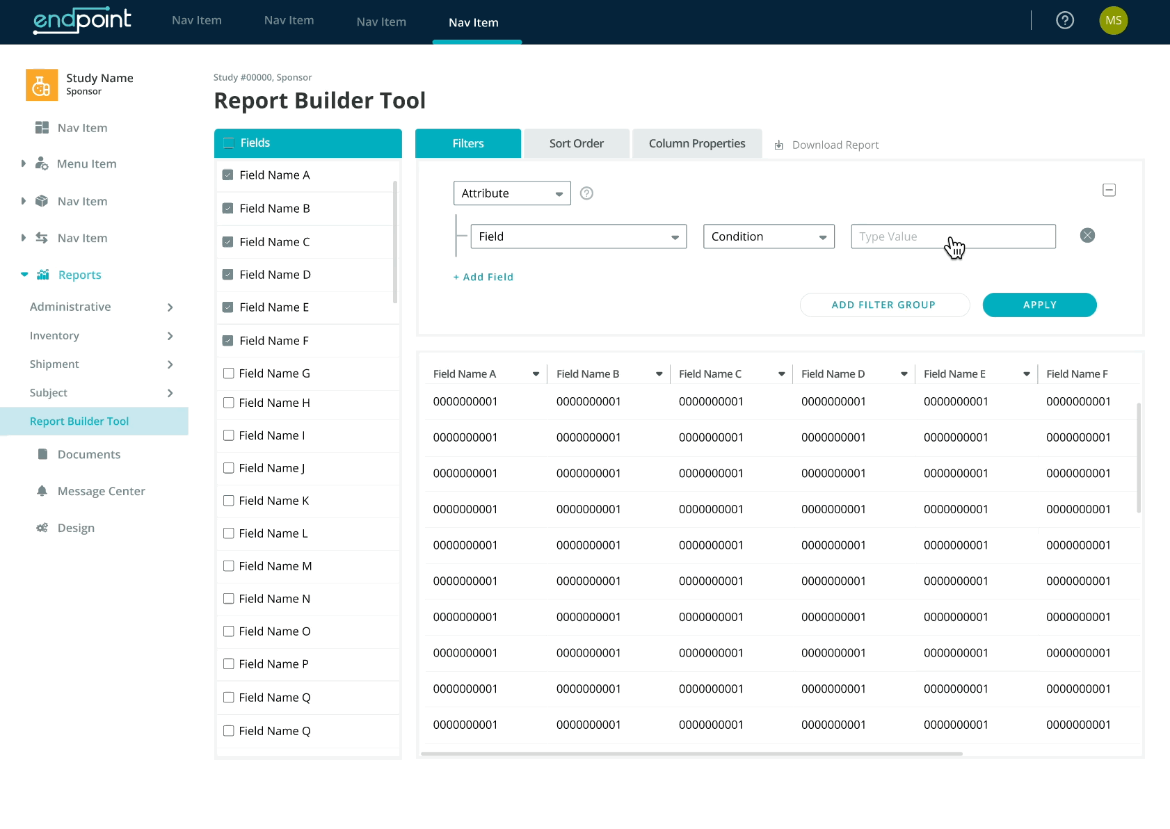
The left navigation provides the product the flexibility it needs to accommodate the design variability in clinical trials and increases the scalability of the product platform. The large number of menu items can be better supported though the distribution of a limited global top navigation and an extensive primary & sub left navigation. The change from top to left navigation can increase the scanability speed and improve the time that it takes for users to locate the Report Builder Tool.
Reduce the total number of options: Group and sub categorize related areas to limit the amount of choices available to the user. This simplifies the decision making process when searching for a new function.

Name & Location
The name of the tool was previously "Ad Hoc Report" and located under the primary menu item of "Ad Hoc Reports." When users were asked to create a custom report, two out of the four users clicked every primary menu item containing the word "Report" (i.e Admin Reports, Site Reports, Depot Reports) before landing on the feature. The name of the tool did not inform the user of it's true functionality. The change to "Report Builder Tool" would better reflect the feature and provide information to the user of the distinction between pre-made template reports and creating your own custom report. With the transition from top to left navigation, the ability to identify the tool is increased due to the collapsible sub groups that provide additional screen estate of highly visible areas.

(2/3) Visual Design
The most consistent feedback from our users was the need for new visual elements. All four users found the user interface visually unpleasant and outdated. The goal was to prevent any UI components from distracting our users away from the task at hand and to ensure visual consistency within the product.
Visual Hierarchy
In the original design, the report function tools were disproportionately sized compared to the main grid. This layout made finding those functions difficult and failed to provide any feedback to the user. The visual hierarchy is an important foundation to the user experience and is critical in navigating a feature.
- Grouping: Areas related to report configuration is grouped together closely at the top of the page
- Natural Eye Movement: Visual elements are placed on the page according to the natural “F” eye scanning pattern which allows us to highlight the key areas on the screen
- White Space: Field selection, configuration, and report view are separated by the use of white space to create a mental disassociation to each section

Icon Usability
The filter functionality contained two primary actions that were represented as ambiguous icons (see left images below), which made it difficult for users to utilize. Dropdown labels were created to provide immediate information to our users regarding the action of the button.
(3/3) Learnability
The users had the most trouble applying filters and were unsure what steps were needed to "complete" the report. The previous experience required users to perform actions on multiple separate modals which did not provide a mental association to the grid. This fragmented flow limits the user from successfully completing the task which prevents the repetition needed for learnability.
"Learnability considers how easy it is for users to accomplish a task the first time they encounter the interface and how many repetitions it takes for them to become efficient at that task." (Nielsen Norman Group)
The "Before" Experience
- The report grid consumes the majority of screen estate
- Report configuration requires separate modals for customization
- Multiple modals would impede the main report grid requiring the users to move or exit the modals
- Filter icons confused the users with ambiguous designs and unclear branching structures section

The New Experience
- All report configuration actions are embedded into the main page and are visible to the user immediately
- Information is provided to the user in easily digestible amounts through grouping and white space
- A tool tip is added to the attribute dropdown option to clearly explain functionality
- A minimize feature was added to improve visibility of the main grid and reduce visual clutter
- "Remove" icon is readily available for each filter line to delete any previous inputs
User Testing
Due to time constraints, a short user test was performed using two internal employees from the HR department who were unfamiliar with our product. The participants were asked to share their screen and complete the task of creating a custom report in the test environment. Although this was before the development was fully completed, both users were able to complete the task smoothly and allowed enough time to incorporate any changes to the last revision cycle.
Highlights
- No visual elements felt distracting to the users
- Users successfully navigated through the initial steps without error
- Both users utilized the tooltip which helped them understand the attribute function
- Users felt this would a simple feature that could be easily used
Results & Reflections
An online survey was conducted with twenty endpoint employees who were familiar with the tool to collect feedback comparing the original "Ad Hoc Report" to the new "Report Builder Tool." We were happy to report that all changes made to the tool were positively received and was incorporated as a featured tool for the sales team.

Through this project I learned the importance of real business constraints and how to be a flexible team member. Not all projects will have a luxurious timeline that allow a thorough design process as I would hope for. However, by following fundamental design principles, it made the decision making process easier regardless of what challenges I faced. Having the opportunity to work closely with the product and development leads helped me gain an even greater respect for the product development process.